HP × AMD End User Event Booklet
A booklet a salesperson could hold at an event and use to explain an entire processor range. It ran in the UK and Ireland, then Italy, then worldwide.

01
The brief
Two brands, one salesperson, one hand
AMD makes the processors. HP makes and sells the machines those processors sit inside. The booklet had to serve both at once, in the hands of a salesperson working a room at the HP with AMD End User Event for the UK and Ireland.
The ask was simple to state and awkward to execute: show every AMD processor line currently available and make it obvious which one a given buyer actually needs. The outcome should be an A5 booklet. Each line had to be tied to a user persona, because an office administrator and a graphic designer do not need the same processor.
The audience is B2B, and the reader is not a technologist. They are someone who needs to answer a question at a stand without opening a laptop.
02
The hard part
The range was the problem, not the pages
AMD Ryzen 200 Series. Ryzen AI PRO 400 Series. Ryzen AI PRO 300 Series. Ryzen AI Max and Max+ PRO. Threadripper PRO 9000 and 7000. Then the HP side: ProBook, EliteBook 6, 8 and X, ProDesk, EliteDesk, EliteBoard, ZBook, ZBook Ultra, Z2 Mini, Z6 Tower. Every one of them a different combination.
I am not a processor engineer, and the source material was a stack of specification tables. Before any of it could be laid out it had to be understood, so I built a run of deliberately ugly PowerPoints and tables whose only job was to find the structure. All of them were thrown away. Design started once the taxonomy held.
What the structure landed on: notebooks first, then mobile workstations, then desktop workstations. A salesperson works upwards from the everyday machine, so the book is sequenced the way the conversation goes, not the way the manufacturer's catalogue is ordered.
03
Decisions
Whose brand is it? Both, but weighted
Typography came from AMD. Colour, structure and page furniture came from HP, because the thing being sold is an HP box. HP's diagonal stripe became the load-bearing element: it works as a frame on a product page and as a mask on a photographic page, so one device holds the whole book together instead of two brands fighting on every spread.
| Cover & titles | Klavika Condensed Bold · the point where the two brand systems met |
|---|---|
| Product names | Klavika Basic Bold |
| Body | Klavika Basic Regular, 12 pt · set large for A5 booklet |
| Figures | Klavika Basic Bold Italic · reserved for numbers only, so a spec never reads as body copy |
| Dense pages | 9 pt · dropping two points cost less than losing the white space |
| Footnotes floor | 6 pt |
Stripe & primary accent HP Power Storm
Feature highlights in body copy
Two colours doing two jobs. Blue carries the structure, the storm grey picks out the one thing on a page a salesperson should say out loud.
04
Pages
The system on the page

-
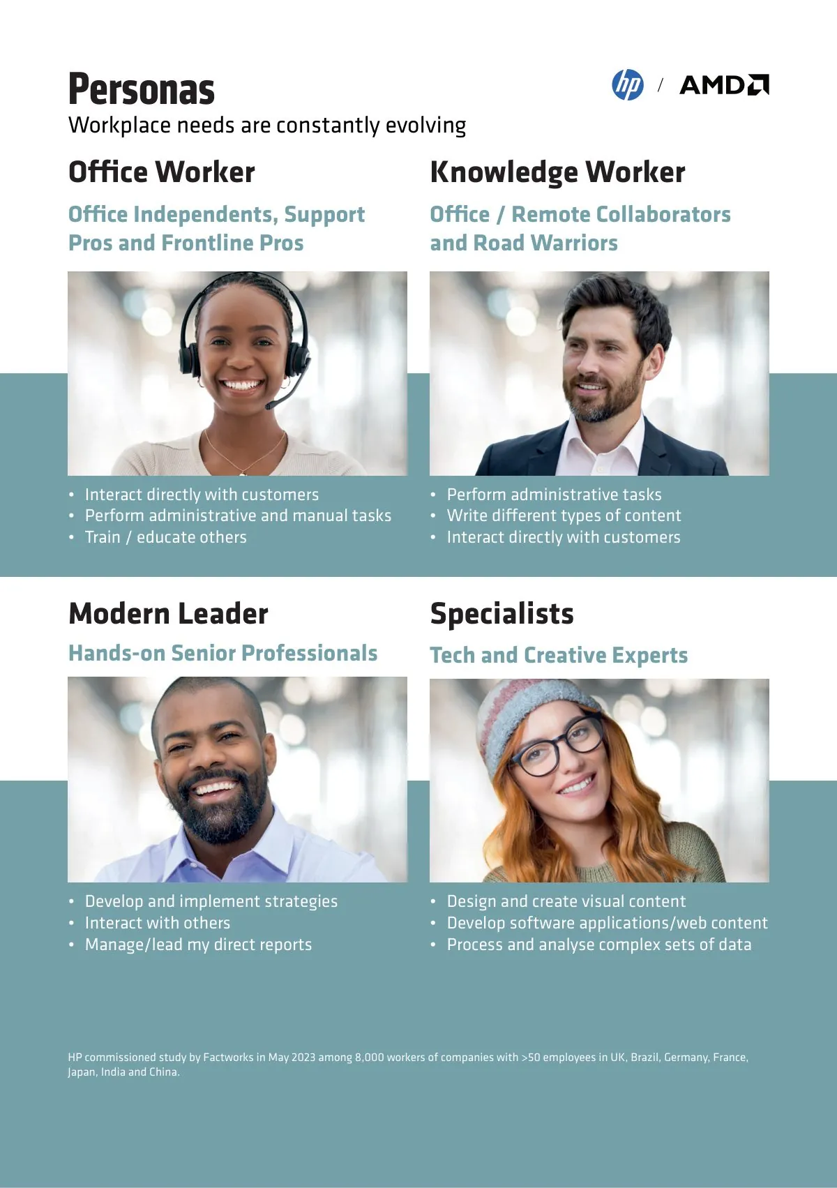
Personas · the spine of the whole book -
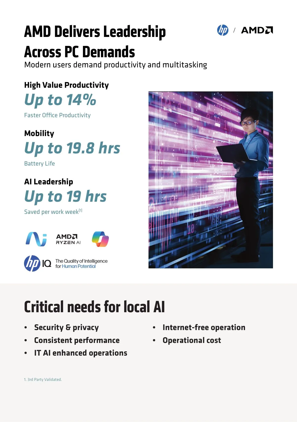
Figures in bold italic, never mistaken for body copy -
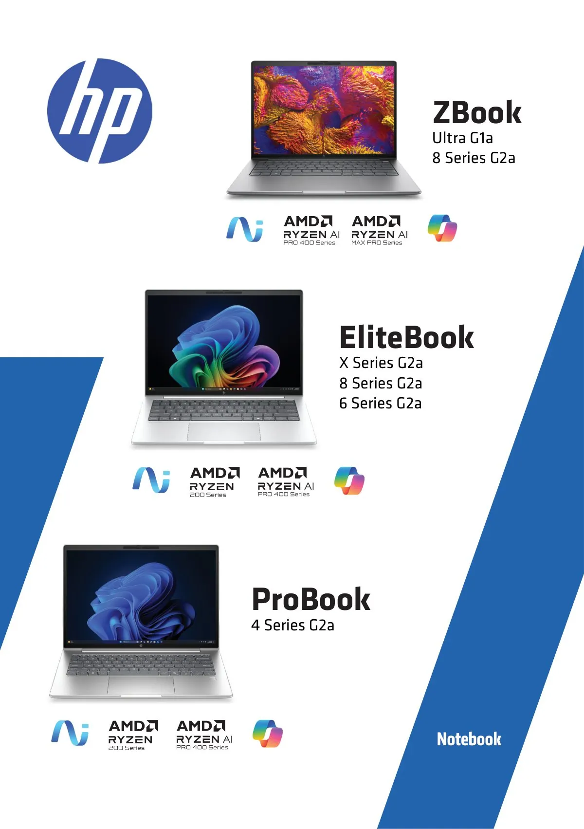
Range hierarchy · notebooks -
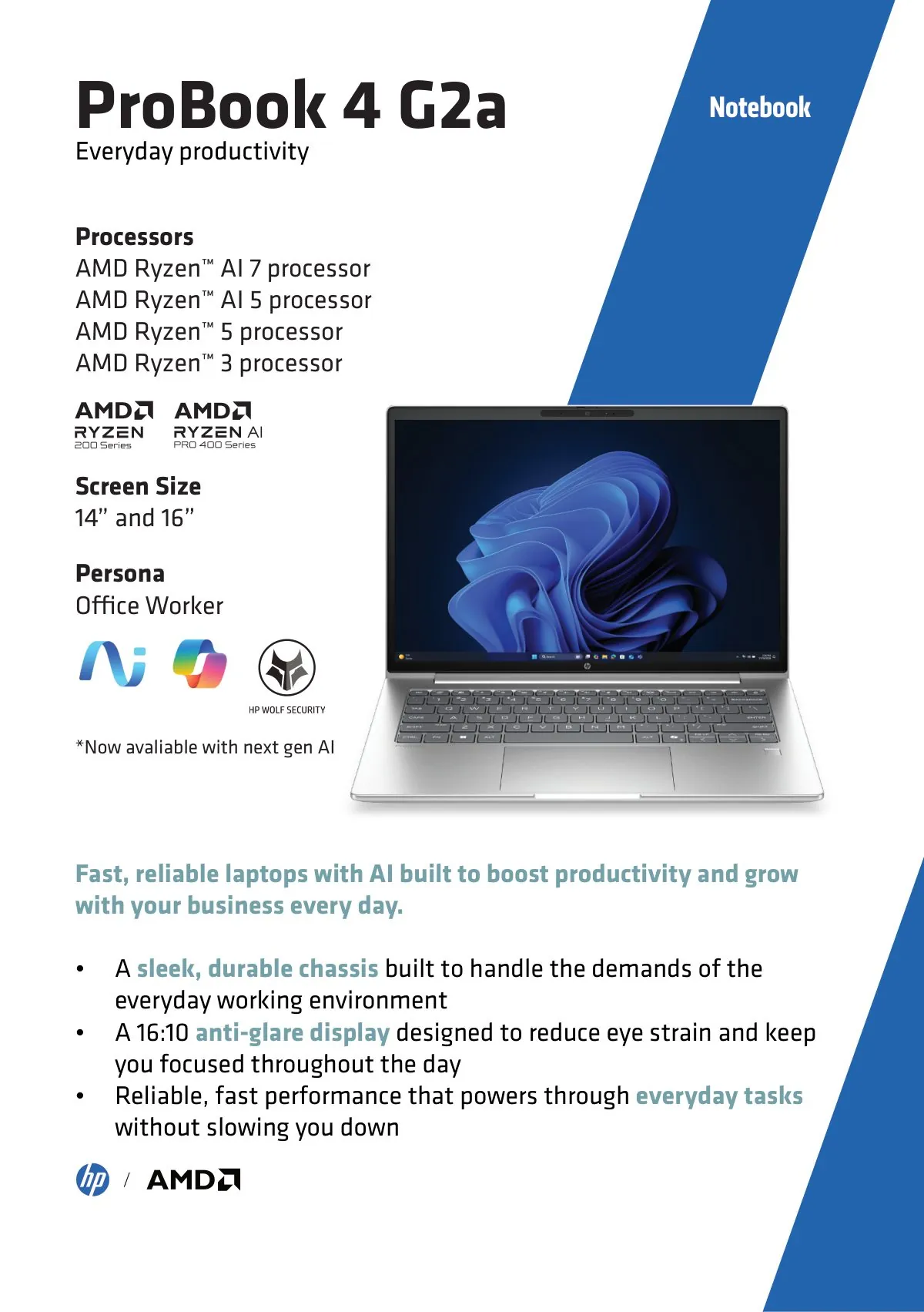
Product page template · repeated eleven times
The EliteBoard spread
A complete PC inside a keyboard, and new at the time. It was the one product in the book that needed explaining rather than listing, so it got two pages and a set of callout illustrations built from scratch.
-
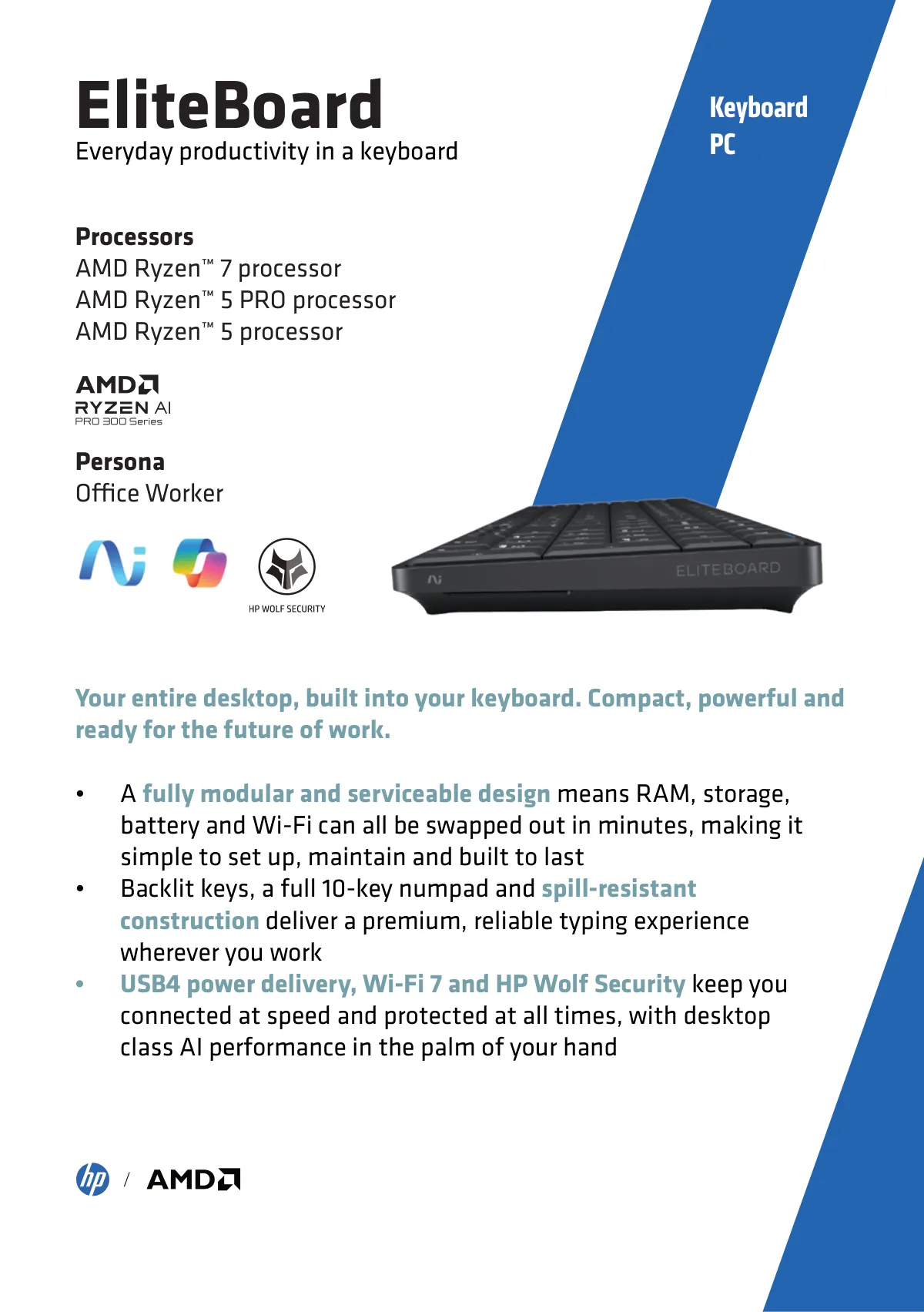
Left page · the product, in the range's standard template -
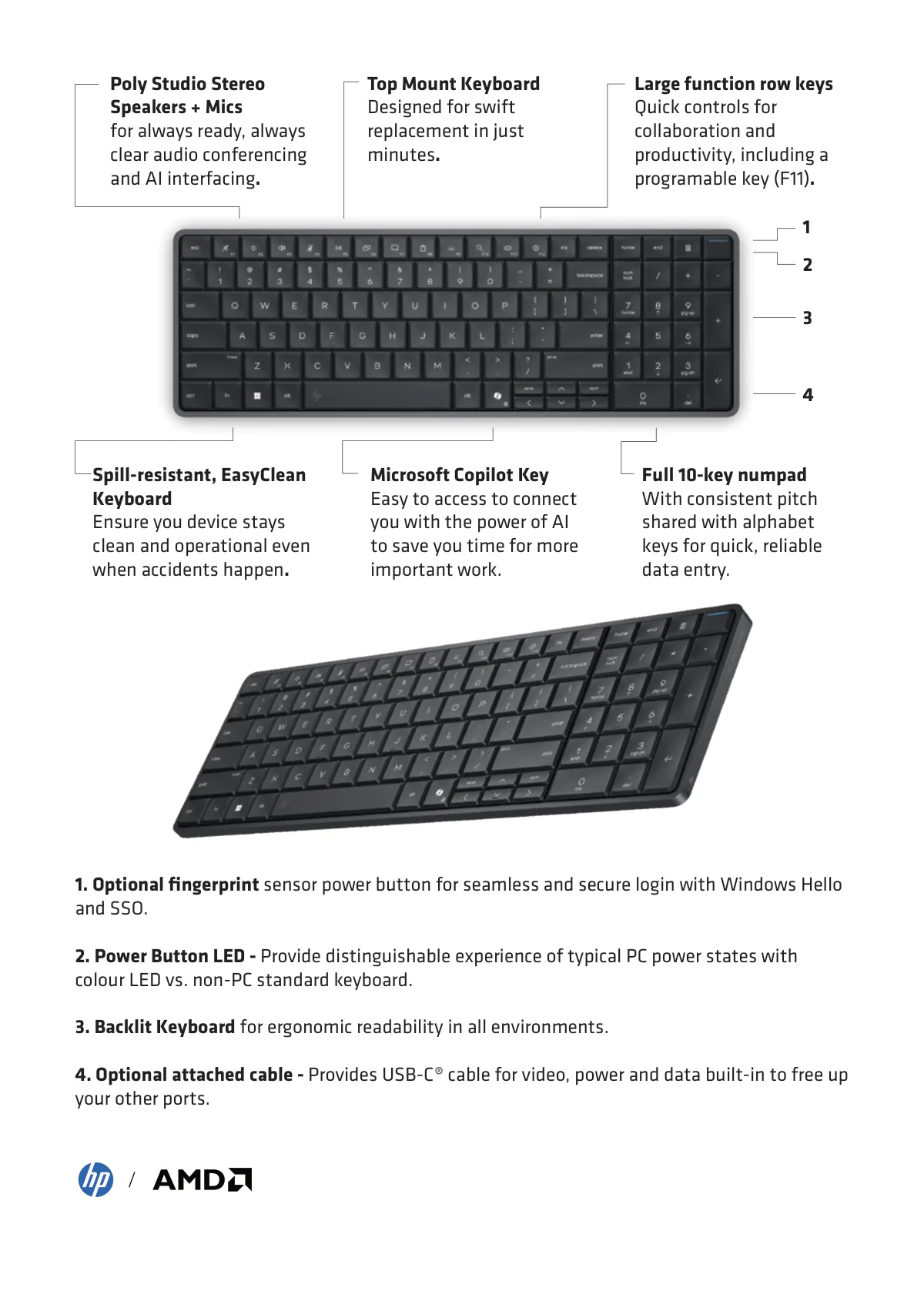
Right page · callouts drawn to explain a product that did not exist before
05
Production
Getting the right processor in the right picture
The client was new and asset library access had not come through yet, so early layouts used publicly available packshots to keep the work moving. Selecting them correctly mattered more than it sounds: HP's own naming convention carries the answer in the final character of the model name. A trailing a means an AMD processor. A trailing i means Intel. So a ZBook Ultra G1a is the AMD machine, and a ZBook Ultra G1i is the Intel version. Putting one of those in an AMD booklet would have been the single worst mistake available.
Every placeholder was replaced with the supplied high-resolution asset and converted to CMYK before the file went to print. Supporting photography was licensed through Envato with worldwide rights, checked before use, because the book was always going to travel further than one event.
06
Three editions
It travelled, and that changed the job
-
Ed. 01
UK & Ireland
Designed, printed and used at the event. Weekly reviews with the client throughout, with the layout developing on top of their feedback each week.
-
Ed. 02
Italy
The Italian AMD team saw it and asked for their own. Copy was exported to Excel and run through GlobalLingo, machine translation followed by native-speaker review, then reflowed by hand. New title, and the London glass façade on the cover replaced with the Duomo. Printed in Italy.
-
Ed. 03
Global
Rebuilt as a template rather than a document, so it could be tailored per event or partner without coming back to me. The UK-specific sales page came out. A full disclaimers page went in, with a numbered reference system running through the book down to superscript markers on individual claims. Accessories were added: monitors, docks and docking displays. Plus a thirty-year AMD and HP collaboration timeline.
The Italian edition, in the room
Printed in Italy and used the way it was designed to be used: picked up off the table and held while someone talks.
-
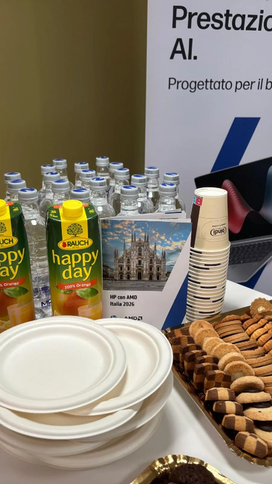
Italian edition · Duomo di Milano, in situ at the event -
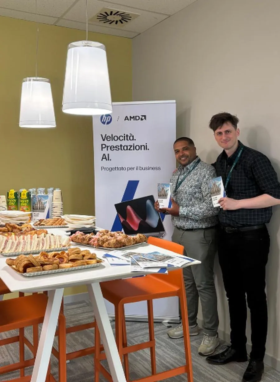
In use at the event · copies on the table and in hand
Added for the global edition
-
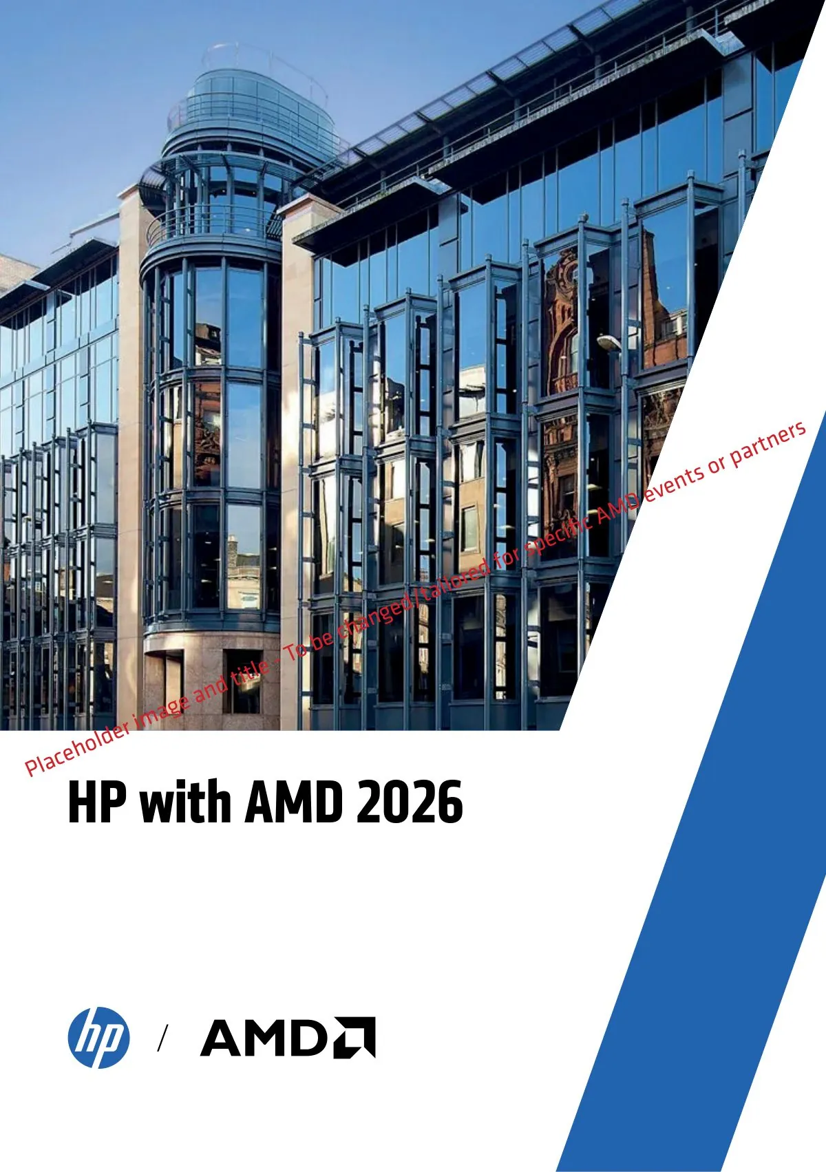
The template cover, marked up · image and title swap per event or partner -
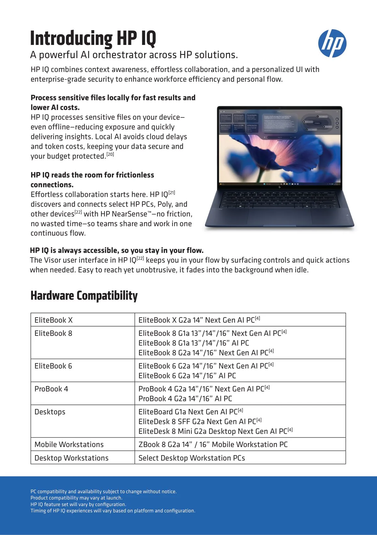
HP IQ · a compatibility table, added for global -
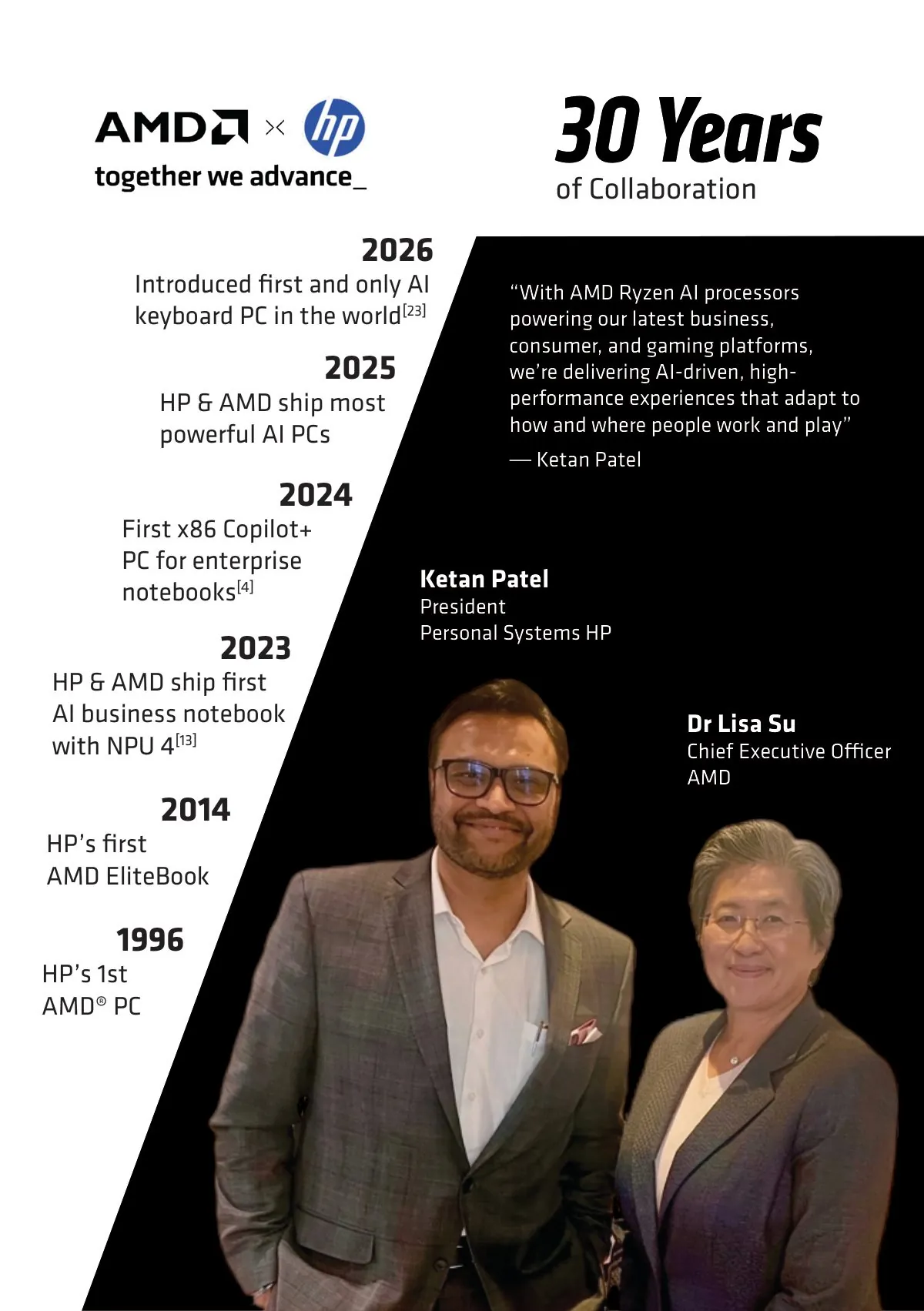
Typed timeline, 1996 to 2026
07
Why localisation is a layout problem
The same line, six times, in a fixed box
A translated layout is not a translated document. Text grows, and it grows unevenly. Here is one product strapline from the booklet against its own English character count. Every one of these had to sit in the same position, at the same size, without breaking the grid or eating the white space.
German and French are the ones that break a layout. If the box only fits English, the job is not finished.
08
Outcome
What I would point at
It was printed and used at the UK and Ireland event, requested and reprinted in Italy, and then rolled out worldwide including the US.
But the pages are not the interesting part. The interesting part is that the third edition is a template. Once you know a document is going to be reissued in another language, for another market, by someone who is not you, the job stops being layout and becomes building something that can be redeployed without you in the room. That shift happened partway through this project, and it is how I would approach anything at this scale now.
What I would do differently: build it as a template from page one. I designed a document and then converted it. Starting from a tailorable master, with the disclaimer reference system and the translation export in place from the beginning, would have saved most of the second and third editions.