Canon Product Launch Enablement
A camera launches on a fixed date. Everything that helps someone sell it has to be finished before that date, signed off in English, and live in seven more languages on the same morning.
01
The brief
Store staff do not get the product on launch day
That is the whole problem in one line. A customer walks in and asks about a camera that went on sale this morning. The person behind the counter has never held it. They need to know what it does, who it is for, which lens to put on it, and how it compares to the four other bodies sitting in the same cabinet.
So the job is to build the material that closes that gap before the doors open. Not one piece, a set. Something for the product page online, something printed for the counter, something for the sell-in conversation weeks earlier, something the retail team completes and is tested on, and something evergreen that explains the whole range rather than one body.
Each of those has a different reader, a different lifespan and a different format. All of them share a deadline, and all of them ship in eight languages.
02
How it ships
English is approved first. Everything else is built from it.
The sequence is the part that makes this work at all, and it is not negotiable. The English master is finished and signed off before a single word goes to translation. Copy, layout, spec figures, footnotes, image selection, all of it settled.
The reason is arithmetic. A change made to the master costs one round of work. The same change made after seven locales have been laid out costs eight, and the eight will not come back identical. Approve late and you are not editing a document, you are chasing a discrepancy across a continent.
-
EN
Master. Copy, layout, spec figures and imagery all signed off here, before anything is translated.
-
DE FR IT ES NL PL PT
Seven locales, built from the approved master. Never in parallel with it.
What this actually buys you: every market is arguing about the same document. When a spec figure changes late, and one always does, there is one place to change it and seven predictable jobs that follow, rather than eight independent negotiations.
The launch moment
03
Amazon A+
The product page is the shop window now
A+ content is the block of imagery and copy that sits below the buy button on Amazon, on desktop and in the app. For a lens like the RF 10-20mm F4 L IS STM it is doing the job a printed brochure used to do: show the thing, show what it makes possible, and answer the question the specification list cannot.
The constraint that shapes it is that you are designing for a container you do not control. Amazon sets the module widths, the stacking order on mobile and the compression. Type that works at desktop width disappears on a phone, so the hierarchy has to survive being reflowed into a single narrow column by someone else’s template.
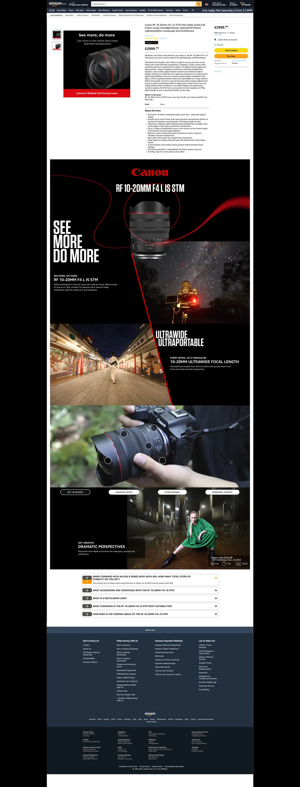
Seen whole, the thing worth noticing is how little room the A+ block actually gets to work in. Above it sits Amazon’s own furniture: navigation, gallery, price, buy box, bullet list. The design has to hold a reader who has already scrolled past all of that, and it has to do it without any of the brand’s usual scaffolding.
The red ribbon is doing structural work rather than decorative work. It carries the eye from the hero panel down through the modules, and because it crosses the panel boundaries it holds the sequence together once Amazon stacks everything vertically on a phone.
The same artwork, live
This is the EOS R7 listing as a customer finds it. The thing to look at is the thumbnail strip down the left: those are the A+ modules, doing a second job as the gallery images.
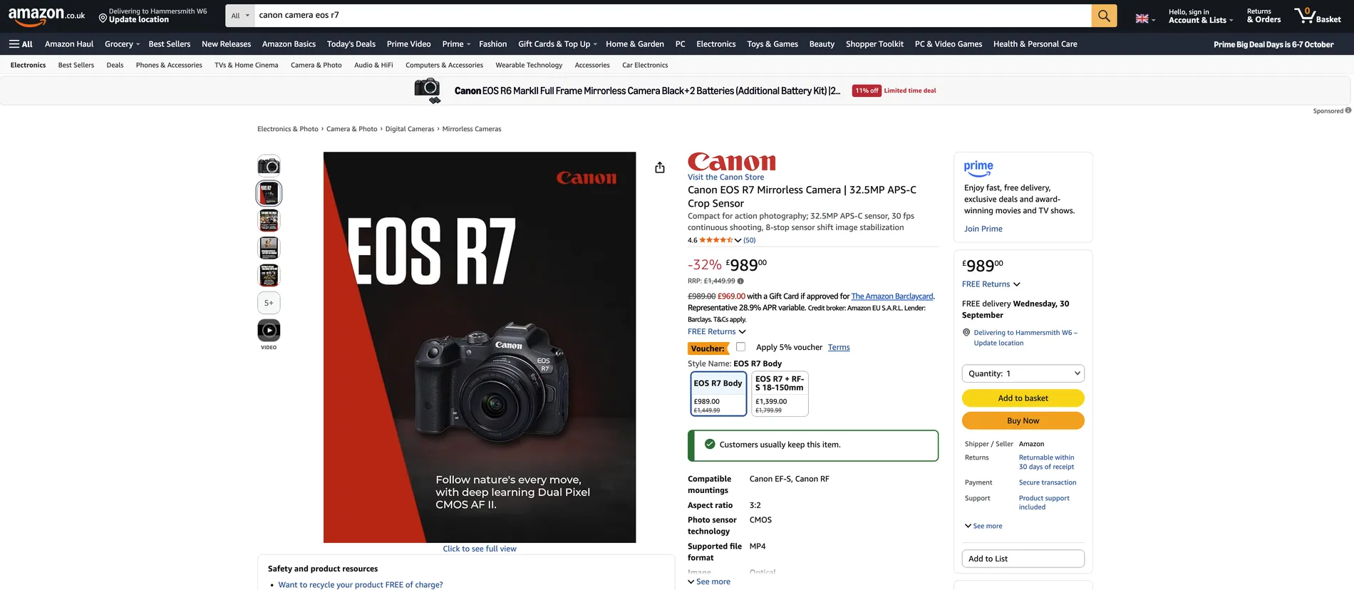
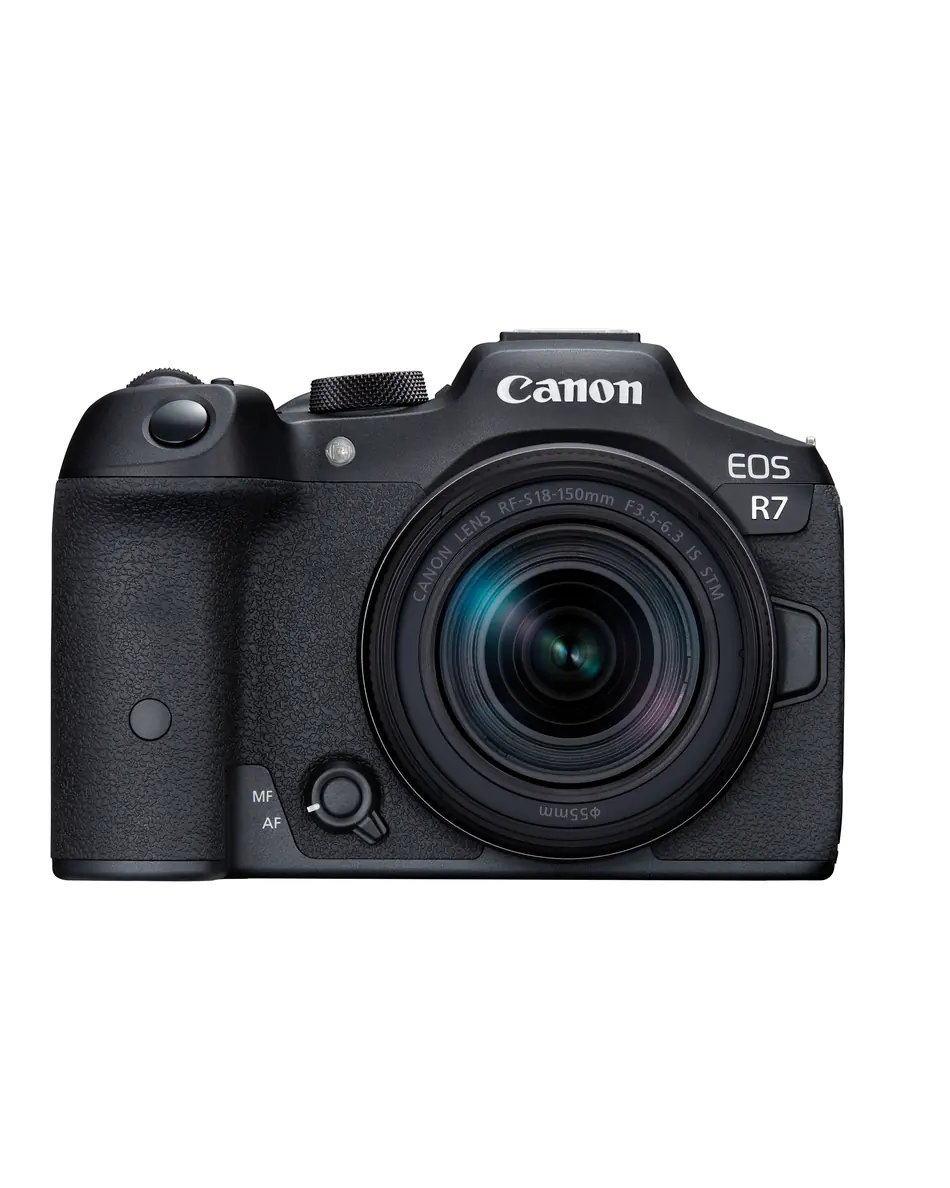
That doubling is why the set is built to a 4:5 frame and why the first module is a plain pack shot on white. Amazon requires a white background for the lead gallery image, so module 01 is constrained by a rule that has nothing to do with the rest of the sequence, and everything after it has to look like it belongs beside that.
What actually gets delivered
A+ is not one artwork. It is a fixed sequence of module slots, each with a defined job, and the deliverable is the set. Below is a complete set for the EOS R7: ten modules, one frame, in the order Amazon stacks them.
The order is the argument. Pack shot, then positioning, then the claims, then the demonstrations, and only then the specification table. The numbers arrive last because by that point the reader has already decided whether they want it.
-
01 Product image -
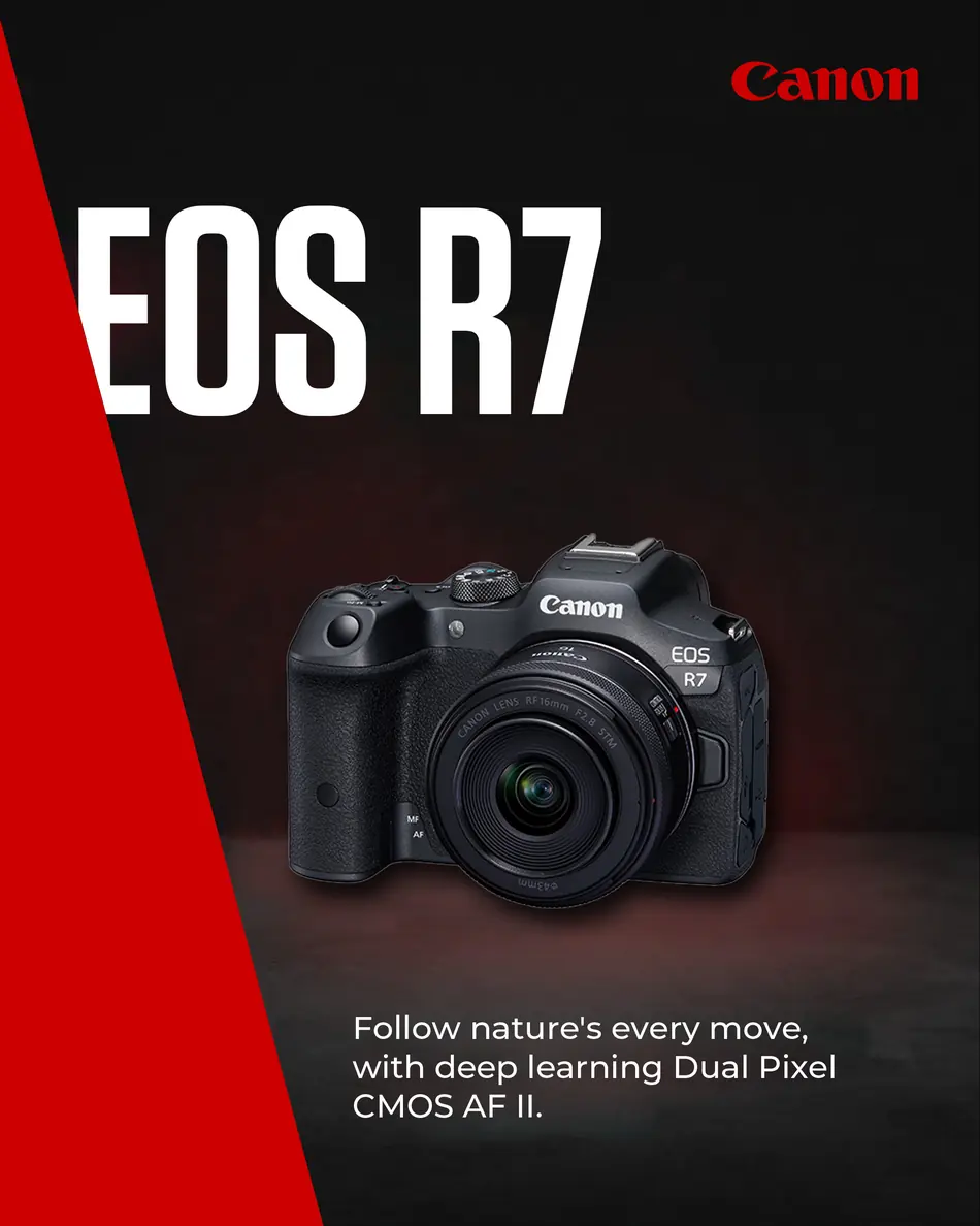
02 Introduce your Product -

03 Key Selling points -

04 Visualize Feature for Target Audience -
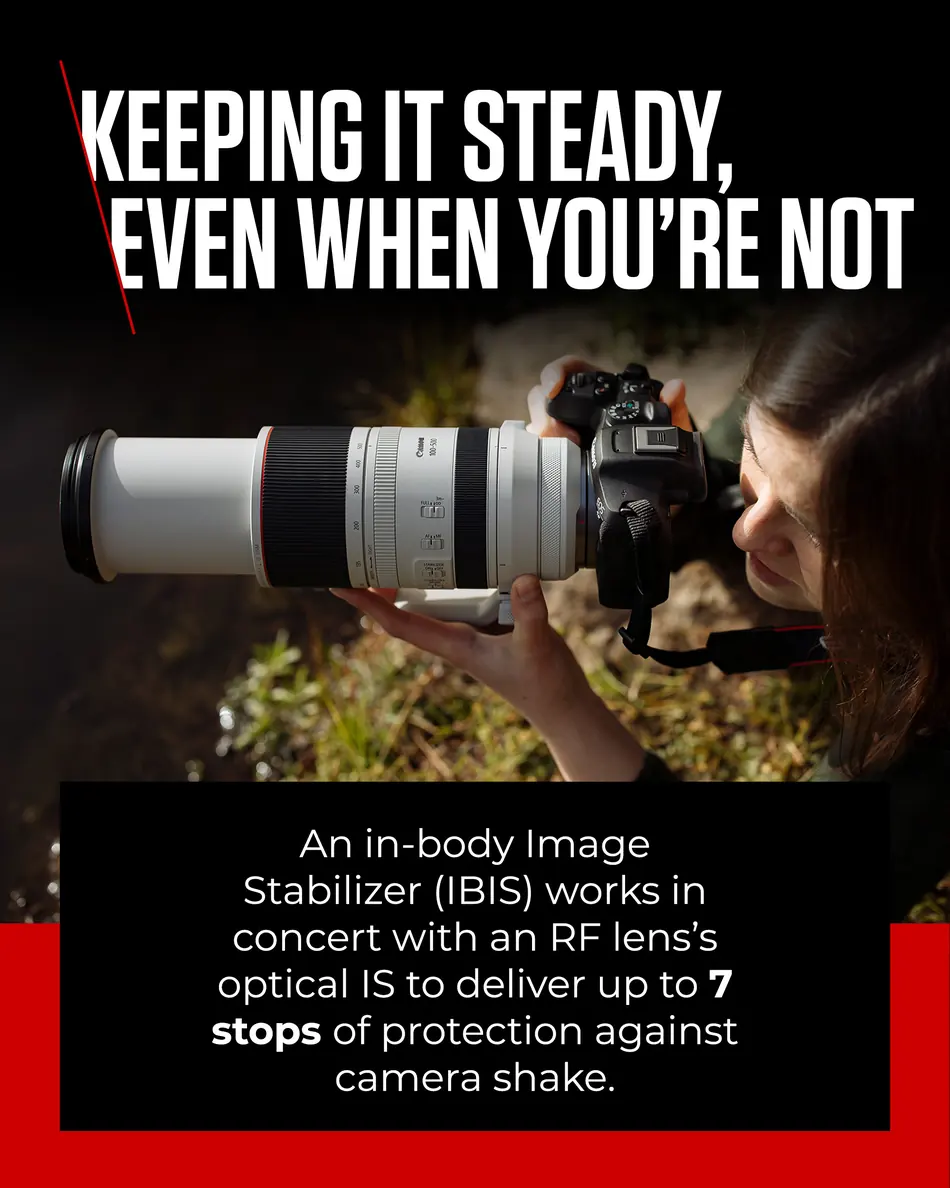
05 Illustrate Key Selling Point -
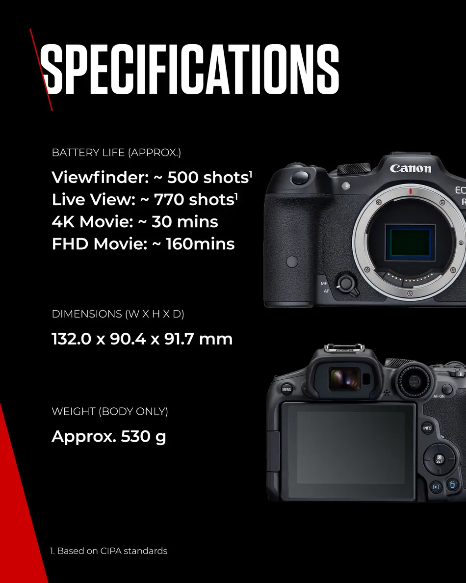
06 Additional Specifications -
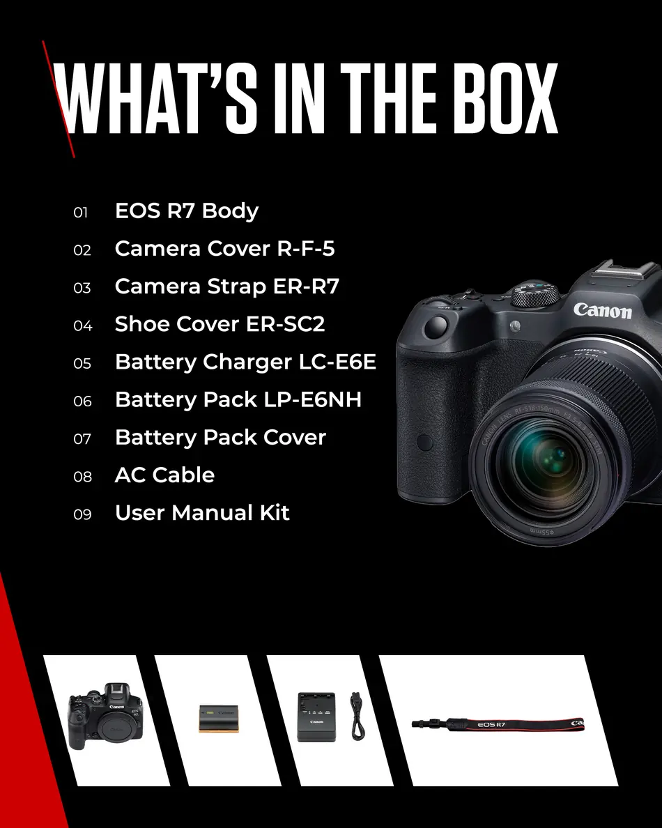
07 What’s in the Box -

08 Illustrate Key Selling Point -

09 Lifestyle Key Selling Point -

10 Use Case
Why the set matters more than any one module: each slot is replaced independently when a claim changes or a market objects, so they have to be designed to be swapped without the sequence collapsing. That is why the red device runs through all ten rather than being composed across them.
04
The one-pager
Everything a salesperson needs, on one sheet
The launch one-pager is the counter document. One product, one sheet, printed double-sided, and it has to answer four questions without being read cover to cover: what is it, who is it for, what do you sell alongside it, and where does it sit against the rest of the range.
So the front is structured to be scanned rather than read. Key features as a short list, the positioning statement as a paragraph, and the genres it suits shown as photographs rather than described, because a salesperson repeating "good for wildlife" is more convincing when they have seen the kingfisher.
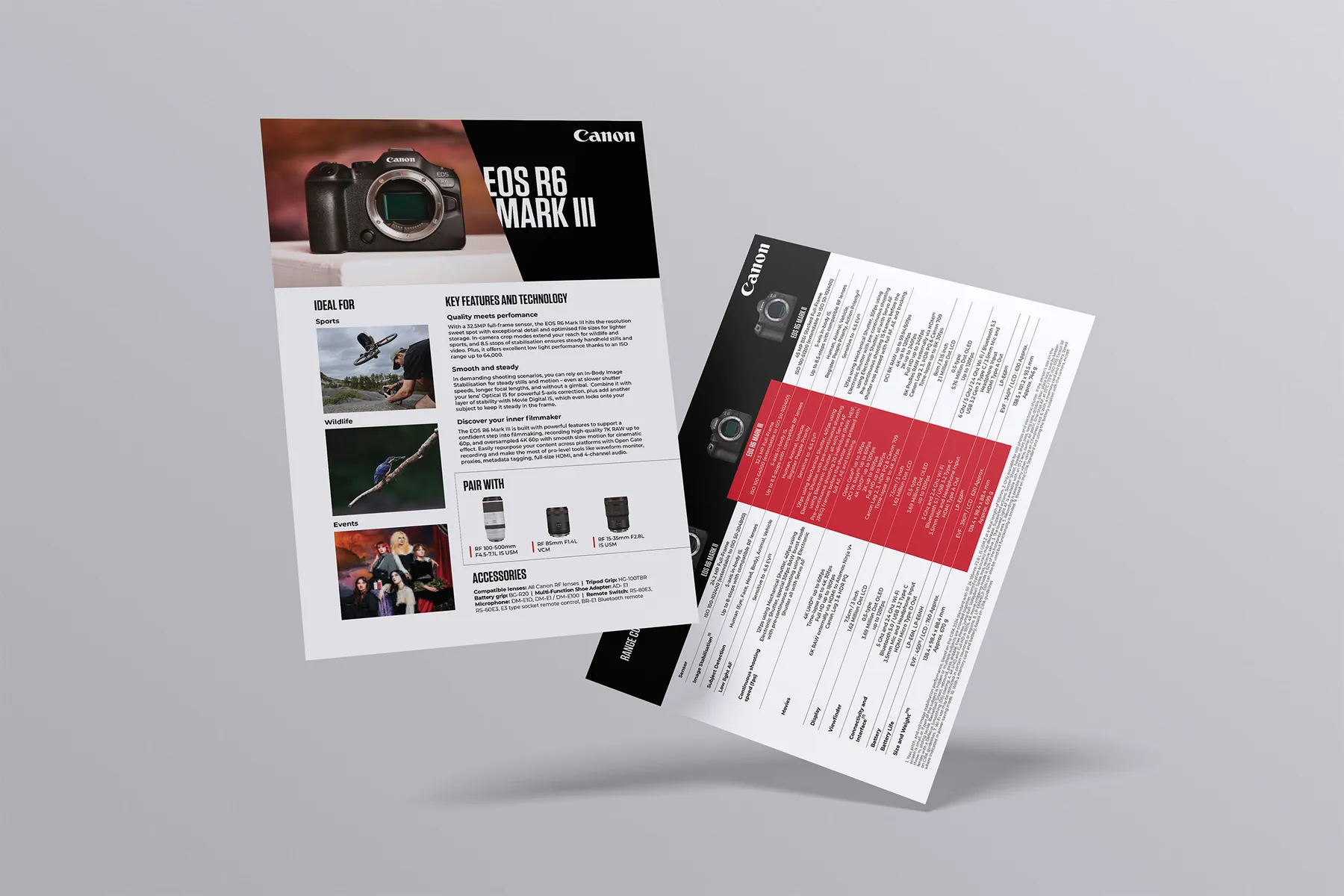
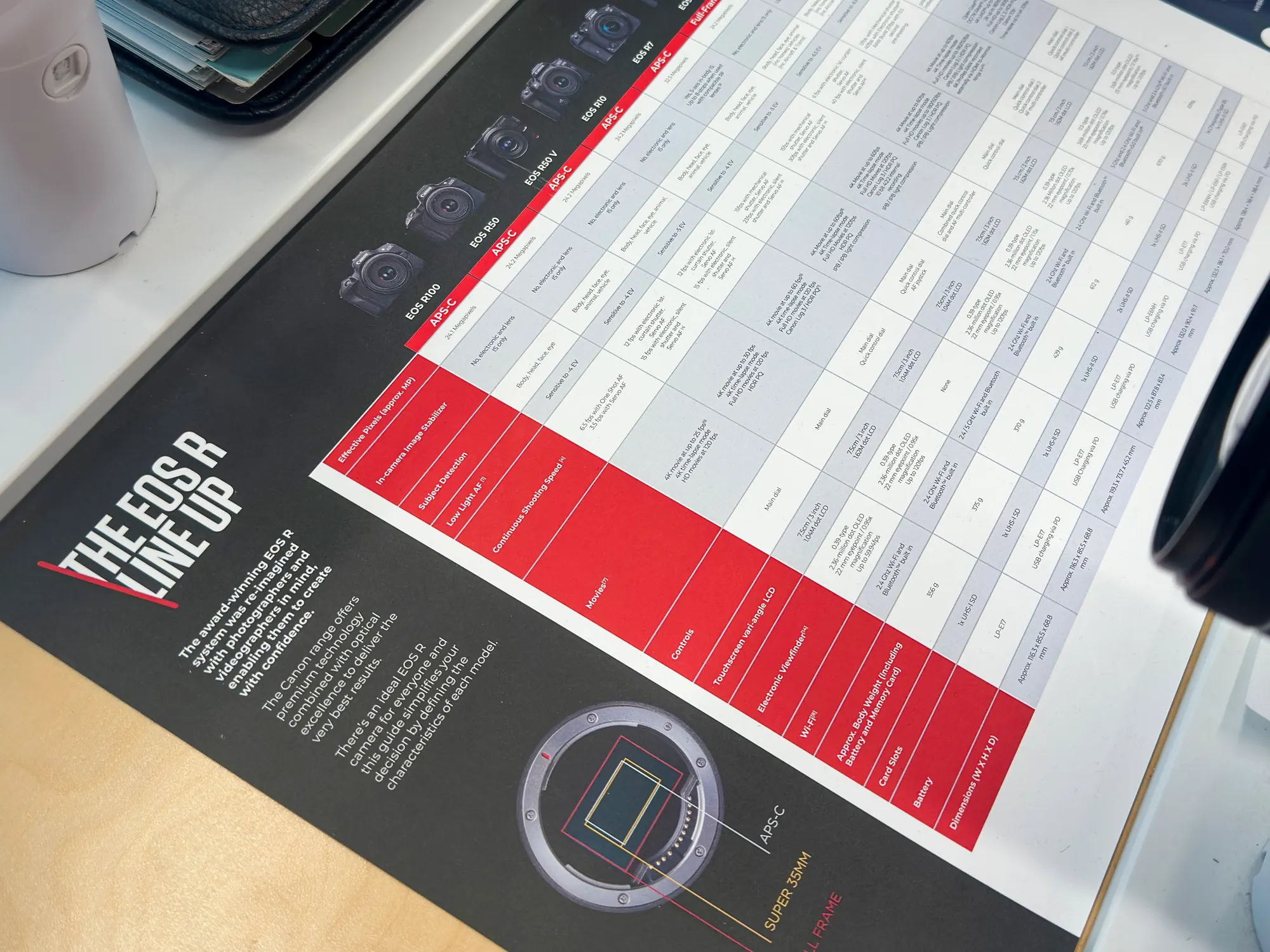
The reverse is the comparison table, and the single most useful thing on it is the red column. The camera being launched is picked out against its neighbours, so the answer to "how is this different from the one I already own" is a glance rather than a reading exercise.
The design decision that matters here: the comparison table is set to be read standing up, at arm's length, under retail lighting, by someone with a customer waiting. That rules out the type size a table this dense would normally get, which is why the sheet is landscape and the column count is capped rather than the type being shrunk to fit.
05
Semi-perm
The version that has to survive the next launch
A semi-permanent sheet is the same product, reworked to stay on the shelf. Launch collateral is written in the present tense of a launch: new, first, just arrived. That language has a shelf life of about six weeks. The semi-perm version strips it out and replaces it with the things that stay true, so the sheet is still correct when the next body arrives and still useful when it does not.
-
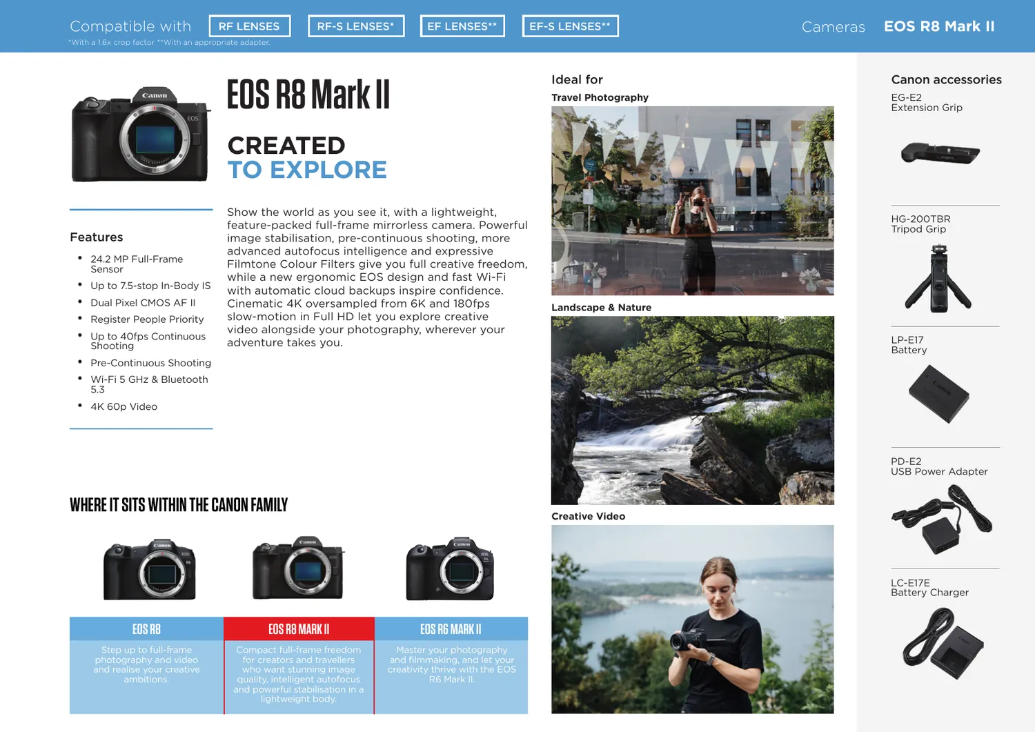
EOS R8 Mark II semi-perm · front -

Semi-perm · reverse, shot on the camera it sells
Note the compatibility bar running across the top: RF, RF-S, EF and EF-S with their footnotes. On a launch sheet that is a detail. On a sheet that lives on the shelf for a year it is the most-read line on the page, because the question customers actually ask is whether their existing lenses will fit.
Where the two versions diverge: the launch sheet sells the news, the semi-perm sells the camera. Same product, same brand furniture, different job, and writing the second one is the harder of the two because nothing carries it except the thing itself.
06
Pre-disclosure
The deck that runs the room weeks before launch
The pre-disclosure deck is centrally produced to support product positioning and sell-in, giving retailers clear and aligned messaging ahead of a launch. It is the earliest thing in the set and the highest stakes, because it is where a buyer decides how much floor space the product gets.
It is shown live, which changes what animation is for. Movement here is not decoration, it is pacing. It controls the order in which a room receives an argument, and it stops a buyer reading the last bullet while the presenter is still on the first.
Canon's brand hands you one strong device, the red diagonal, and very little else. The deck geometry is cut on that same angle, and the angle is taken from the body being launched, so the page and the product agree rather than merely coexisting.
The one accent, on every slide
The evergreen set
07
E-learning
A module, and a test that proves it landed
The EOS Master modules are structured knowledge with a knowledge check at the end. The check is the point. A sheet on a counter tells you the information was made available; a score tells you whether the person can explain the product to a customer without it in front of them.
Built in dominKnow ONE, and this is where the eight-language rule stops being an abstraction. The module opens on a language picker, and every string, caption and quiz answer behind it exists eight times over.
-
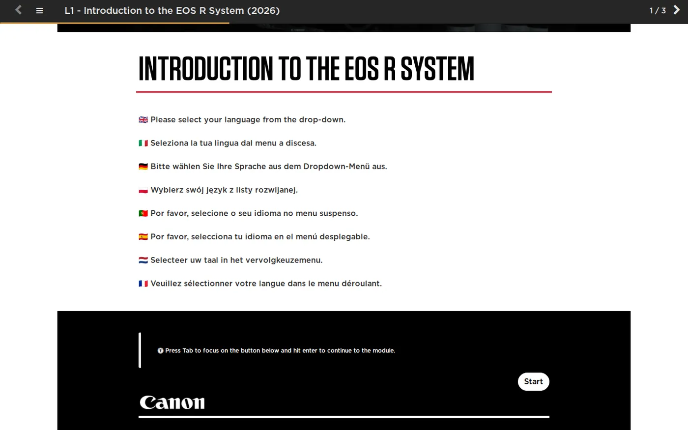
The module opens on eight languages, before anything else -
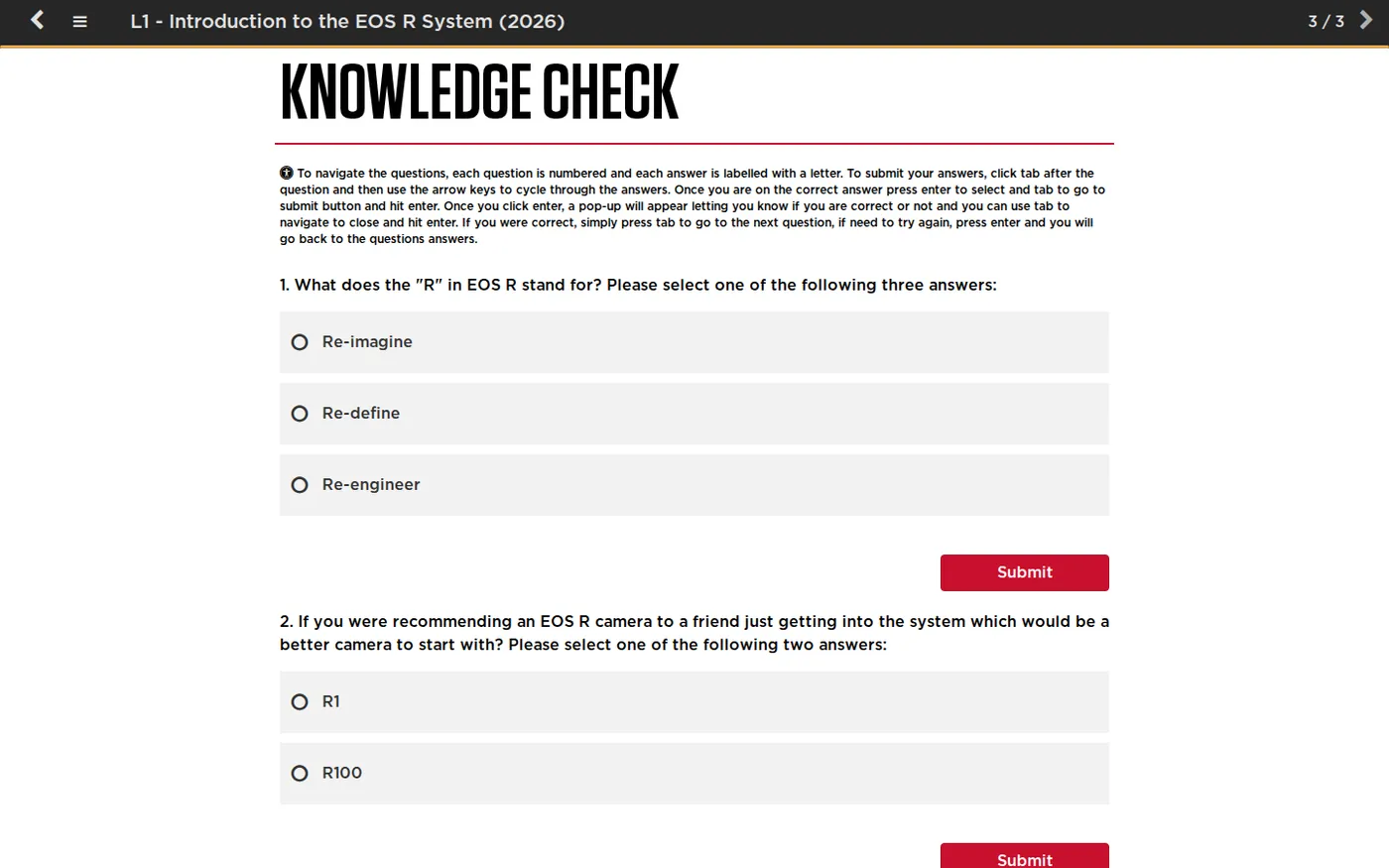
Knowledge check · the part that measures retention
The accessibility instructions on the quiz screen are not boilerplate. Retail teams complete these on whatever hardware the store has, so the module is operable by keyboard, every answer is labelled, and the navigation is explained in the module rather than assumed.
The unglamorous half of this job: translation vendors return subtitles as SRT, the authoring platform wants WebVTT, and the two are close enough to look interchangeable and different enough to fail silently. Every localised module needs its captions converted and checked, or it plays no captions at all in that market and nobody finds out until a store reports it.
2
00:00:04,500 --> 00:00:08,250
Der EOS R6 Mark III ist auf
Video ausgelegt.
WEBVTT

00:00:04.500 --> 00:00:08.250
Der EOS R6 Mark III ist auf
Video ausgelegt.
A header line, a full stop instead of a comma in every timestamp, and the cue numbers dropped. Trivial to describe, and it is the difference between a module that plays captions in German and one that plays none. Multiply by seven, every time a module is revised.
The category guides
08
Hierarchy and range map
Two ways to answer "which one do I need"
These two belong together, and in store they are mounted side by side. They answer the same question from opposite directions, which is why neither replaces the other.
The hierarchy sorts the range by the person rather than the product. Beginner, enthusiast and professional down one axis; everyday moments, life experiences, enhanced control and peak performance across the other. Sensor size and hybrid or video-only are carried as tags. You arrive knowing what kind of photographer you are and leave with two or three candidates.
The range map does the opposite. Every body across the top, every specification down the side, no interpretation at all. You arrive with two candidates and leave knowing which one has the card slot you need.
-
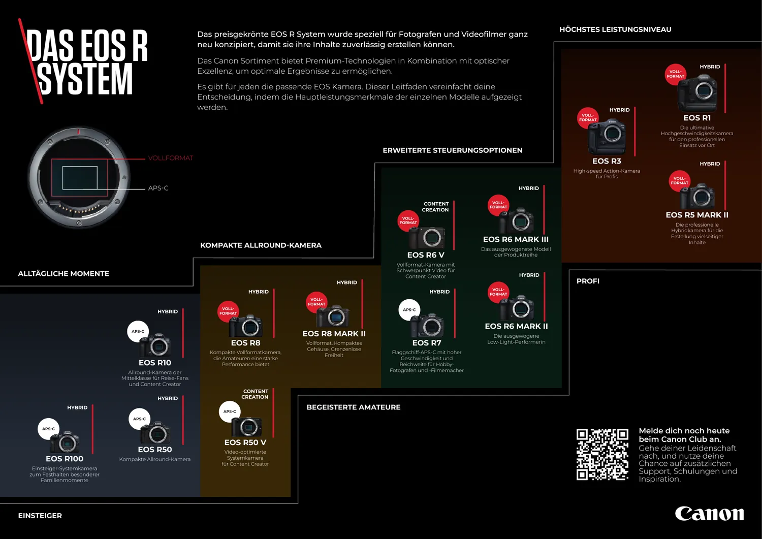
Hierarchy · German edition -
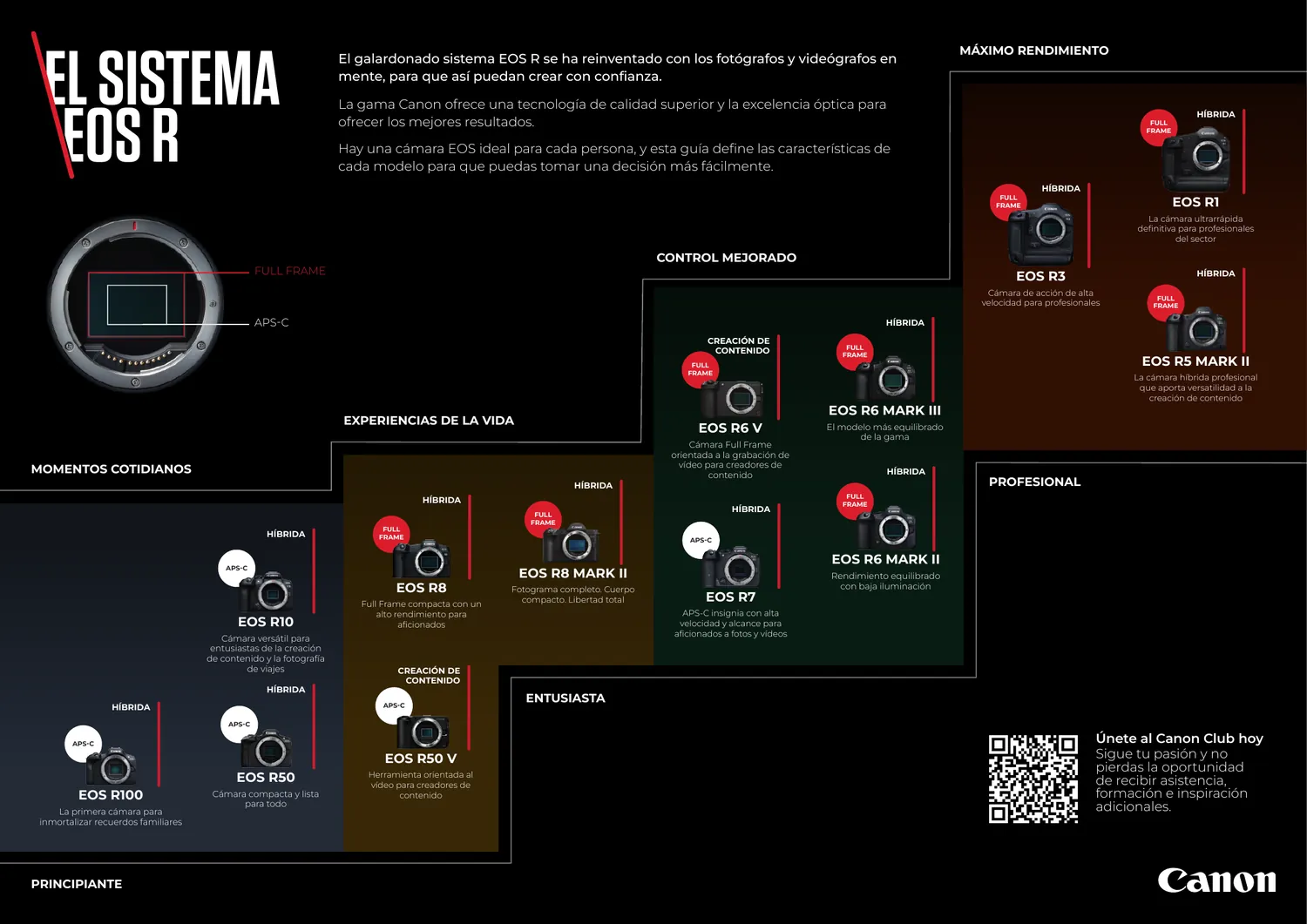
Hierarchy · Spanish edition, same grid
Those two are worth looking at together. The panels, the nesting and the tag positions are identical, and only the words move. That is the master doing its job: German runs long, Spanish runs longer, and neither is allowed to push a camera body out of its panel.
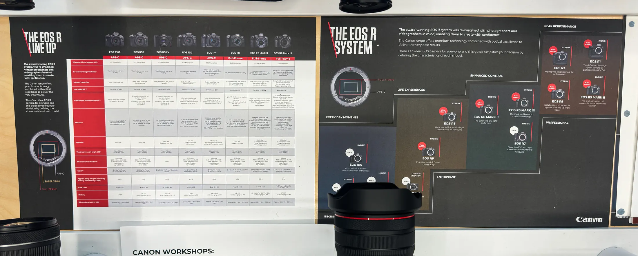
Why they are designed as a pair: a customer who does not know what they want needs the hierarchy, and a customer who does needs the map. Putting them on one sheet would serve neither, so they share a visual system and a wall, and the salesperson decides which one to turn to.
09
The System brochure
Thirty-two pages, and not a spec sheet among them
The EOS R System brochure is the biggest piece in the set and the only one written to create desire rather than resolve a question. It introduces the range through use cases, real creator stories and photography made on the cameras it is selling, which means every image has to earn its place twice: once as a picture, and once as evidence.

The structure runs from the widest possible invitation down to the specific. Opening spreads on what the system is for, then a page per body, then the lens family, then the people using them. A reader can stop at any point and still have received a complete argument.
-

A full-bleed opener, no product shot at all -
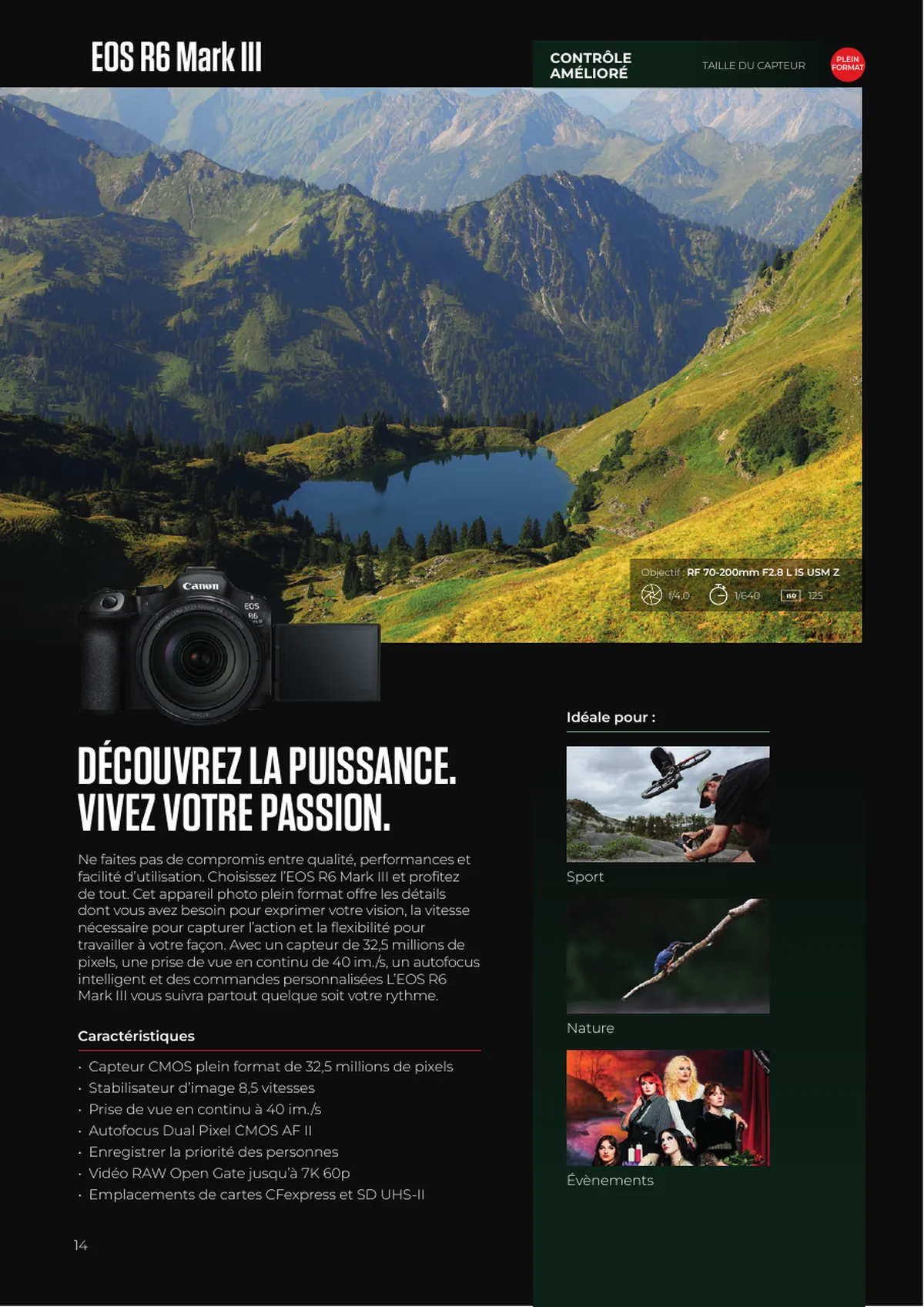
One page per body · the template that repeats eighteen times
That per-body page is the engine of the whole document. Eighteen cameras, one grid, with the colour band and the section tag changing to signal where you are in the range. Building it once, properly, is what makes a thirty-two page book localisable into seven languages at all.
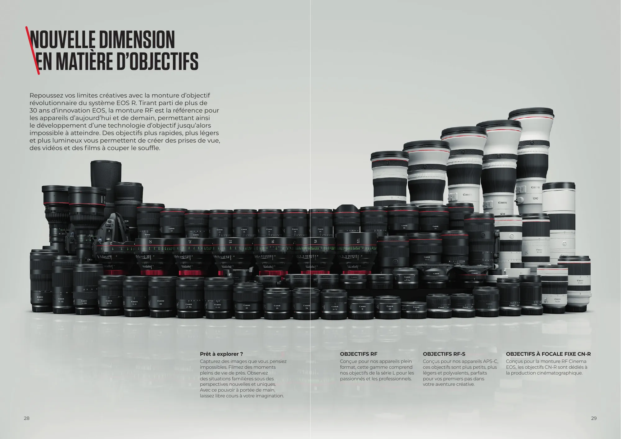
And it closes on people rather than products. Photographers, where they work, what they shoot and which body they use, in their own words, each with a frame of their own. It is the only part of the document a customer is likely to read twice.
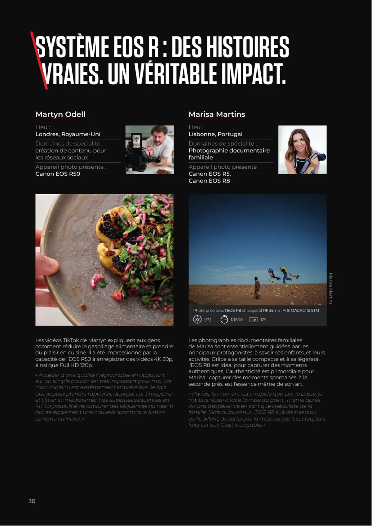
The hard constraint on a book this size: thirty-two pages across eight languages is two hundred and fifty-six pages of artwork, and the only way that is survivable is if the English master is genuinely finished first. Every late change to the master is eight pages of rework, and it is never just one change.
10
The glossary
Some words translate. Acronyms do not.
Canon's lens technology arrives as a wall of acronyms, and the obvious instinct is to translate them along with everything else. That instinct is wrong, and it is wrong for a physical reason: the acronym is printed on the barrel of the lens. USM is USM in Milan and in Munich, because it is engraved on the thing sitting in the customer's hand. Translate it in the leaflet and the leaflet stops matching the product.
So the rule the glossary locks is: keep the English acronym, and localise the expansion beside it in brackets. This is Canon's own multi-language convention, which is the best argument for it. The job was applying it consistently rather than inventing it.
| USM | Ultrasonic Motor · acronym fixed, expansion localised |
|---|---|
| VCM | Voice Coil Motor · French expansion: moteur à bobine mobile |
| PZ | Power Zoom · expansion localised, PZ never |
| IS | Image Stabiliser · appears in the product name itself |
The other half of the rule is knowing which terms are not technology names at all. Rear filter is a description of a part, not a badge, so it translates properly and becomes filtre arrière. Control ring is the same. Deciding which side of that line a term falls on is the actual glossary work, and it is the thing that stops seven markets each inventing their own answer.
Why this sits in a design portfolio: because it is a design decision about a fixed element in a layout. A term that expands differently in every market, but must stay visually identical next to a locked acronym, is a typesetting constraint before it is a translation one.
11
Outcome
What I would point at
The brochure is the piece I would show. This is the work I would rather be judged on, because it is the harder skill and it is the one that compounds. A booklet is finished when it prints. A launch system is finished when someone who is not me can run the next one without introducing an inconsistency across eight markets.
The through line from the Amazon page to the store wall is the same in every format: decide once, in English, in a structure that can absorb a longer word without falling over. Everything downstream is then a production problem rather than a design one, which is exactly where you want it.
What I would do differently: write the term list before designing anything, not after the second market queried a translation. Most of the inconsistency I have had to chase across this account existed because the vocabulary was settled later than the layout. On anything recurring, the glossary is the first deliverable, not the last.